Make the thesis immediate.
Capital efficiency and operator mentorship expressed in one focused story.


Success story · 2017—present
Mentors Fund × Augment
A brand and website for the seed-stage venture firm pairing capital-efficient founders with mentors who have built, scaled, and exited companies themselves.
The problem
Mentors Fund brings more than money to the table. Its partners are operators with meaningful company-building and exit experience, but the brand needed to express that practical advantage without looking like another traditional financial institution.
The digital story also had to work for several audiences at once: founders evaluating fit, investors comparing paths to participate, and a broad portfolio whose collective momentum needed to feel credible—not reduced to a wall of logos.
Capital efficiency and operator mentorship expressed in one focused story.
A contemporary system with energy, clarity, and earned confidence.
Distinct paths for founders, investors, mentors, and portfolio discovery.
How we solved it
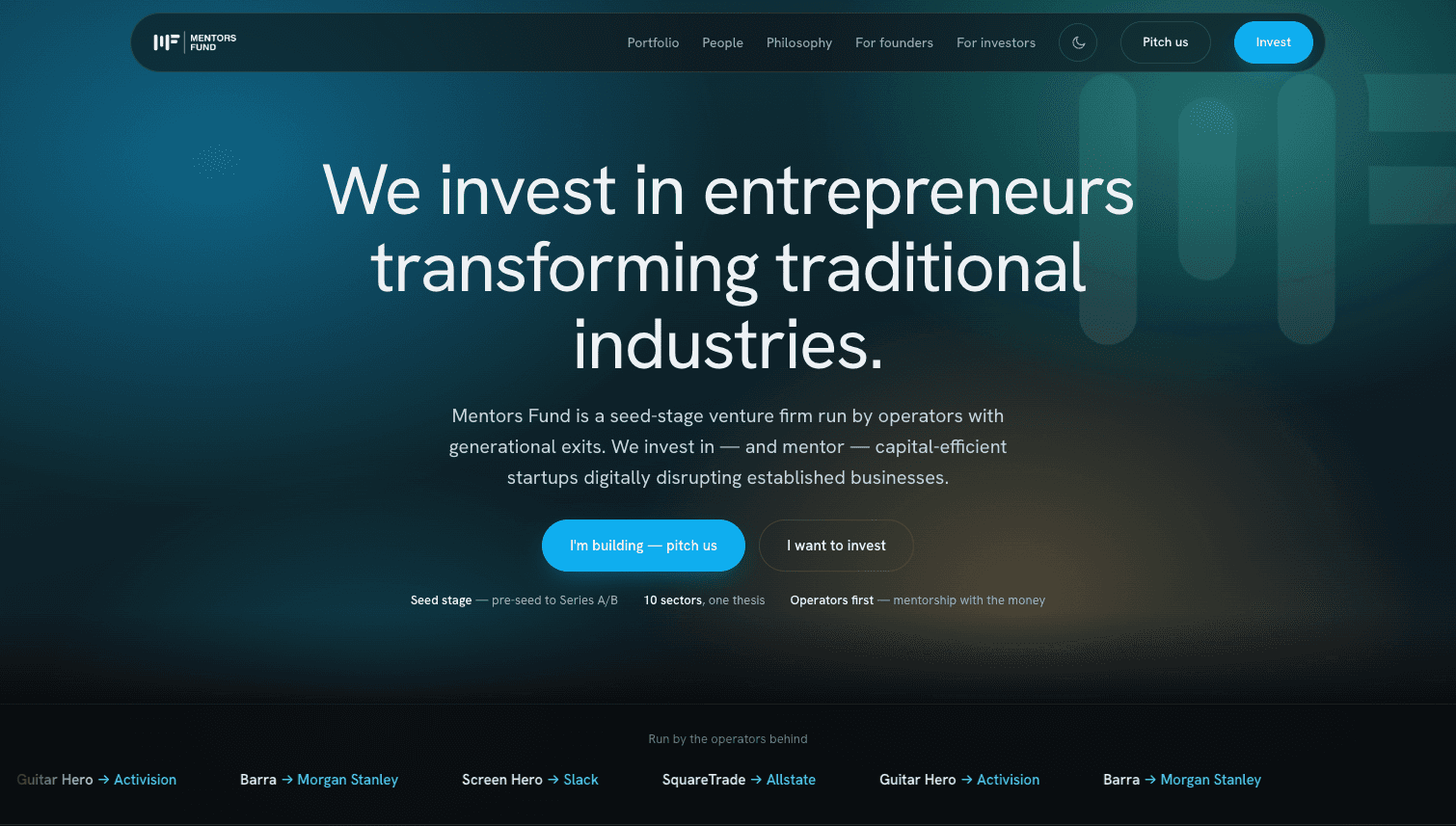
We clarified the narrative around a simple difference: Mentors Fund is run by operators who invest in—and actively mentor—entrepreneurs transforming traditional industries. The experience leads with that conviction, then supports it with people, portfolio evidence, and clear ways to engage.
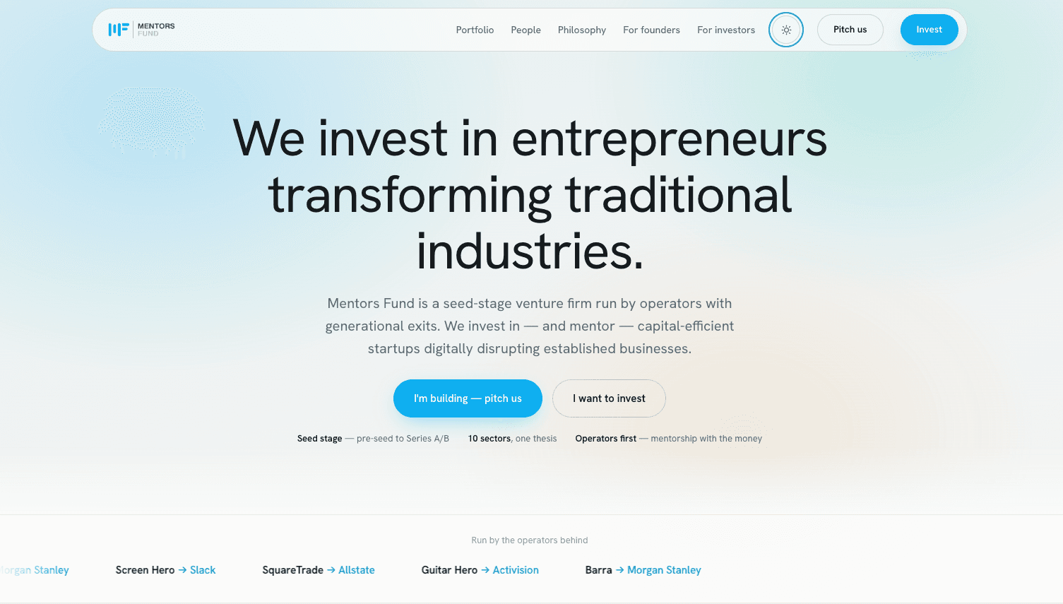
A distinctive signal-inspired mark, electric blue accent, editorial typography, and dual light-and-dark modes create a system that feels technical and human at once. Reusable modules make the website easy to extend as the portfolio and mentor network grow.
Brand strategy
Logo & visual identity
Content architecture
Website UX/UI
Website development
Responsive design system
The identity turns mentorship into a visual signal: structured, directional, and built from parts working together. The compact system remains recognizable from navigation and social profiles to presentations and portfolio communications.
 Mentors Fund · Primary identity
The responsive website turns the fund's story into a deliberate journey: understand the thesis, see the proof, meet the operators, explore the portfolio, then pitch or invest through a pathway built for that audience.
01 / 05
Light and dark experiences give the brand range without losing recognition. The same structure, typography, actions, and signature blue maintain continuity in every context.
The results
The result makes Mentors Fund's difference visible before a conversation begins. Its thesis, track record, people, and participation models now work as one coherent narrative for founders and investors.
The system also gives the team a durable foundation: one identity and modular website capable of supporting a growing portfolio, mentor network, and evolving investment model.
active companies presented through a clearer portfolio story
raised by portfolio companies from leading investment partners
sectors organized around one focused investment thesis
the year the Augment and Mentors Fund partnership began
“Augment understood that our brand needed to reflect more than investment—it needed to communicate the experience, judgment, and hands-on mentorship behind the fund. They translated that idea into a distinctive identity and a digital experience that makes our story clear, credible, and easy to engage with.”
Shuja Keen · Founding Partner, Mentors Fund
Portfolio figures and positioning are drawn from Mentors Fund's published website.
Building a brand around real expertise?


